Oct 31

The Halloween Baking Championship.

halloween bakingpin it!

I can get down with Halloween. I love the idea of it, but I usually procrastinate or don’t really have anywhere cool to go, so I opt out more often than not. What did you do for Halloween? I hope you wore a sparkling polyester unitard and stuffed your face with candy because I sat at Houston International Airport for 4 hours waiting for my connecting flight to Jackson, Mississippi.  (High five to this airport for providing FREE unlimited internet!!) The good news is that it gave me ample time to archive photos. I think this is the first time I’ve ever posted pics from a show RIGHT after it aired as opposed to 1-3 years later. Hooray!

halloween_baking_championship0pin it!

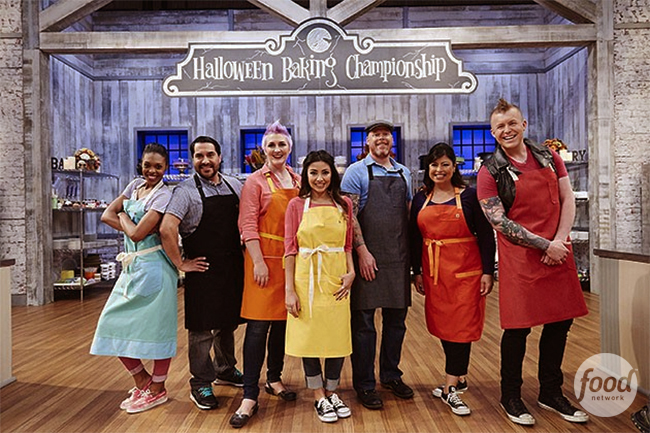
I art directed my first cooking show, Sweet Genius 2, about 5 years ago. I remember loving it and telling my colleagues that I wanted to work on more cooking shows.  I love custom making anything and everything, so there is something about the hand-crafted nature of cooking and baking that complements my design/build/arts-and-crafts approach to art direction. I worked on a lil’ Food Network special called the Holiday Baking Championship last year, and I had no idea that it would blow up into an entire franchise of baking shows including the Kids, Halloween, and Spring Baking Championships.

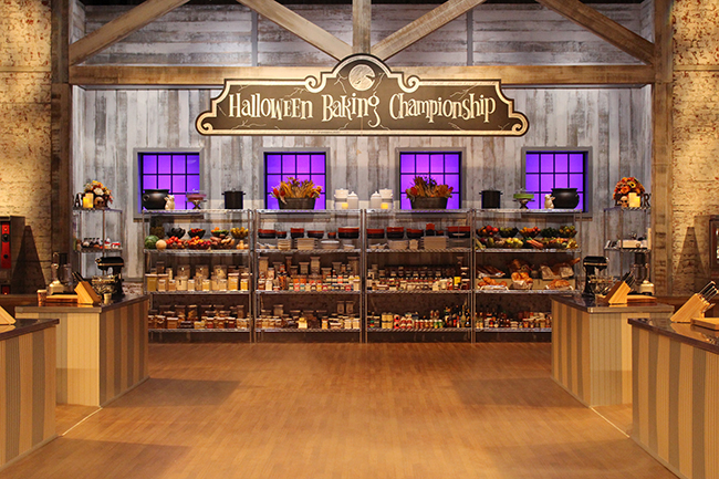
The shell of this set was designed by Shaffner & Stewart and my amazing art department KILLED it this year with the set dressing and custom builds. We had so much fun making all things smoky, slimy, and spooky.

halloween_baking_championship1pin it!

halloween_baking_championship2pin it!

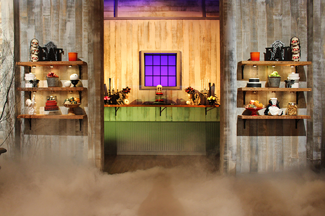
My set decorator Andrea and I spent an absurd amount of time scooting things around on these shelves.

halloween_baking_championship3.5pin it!

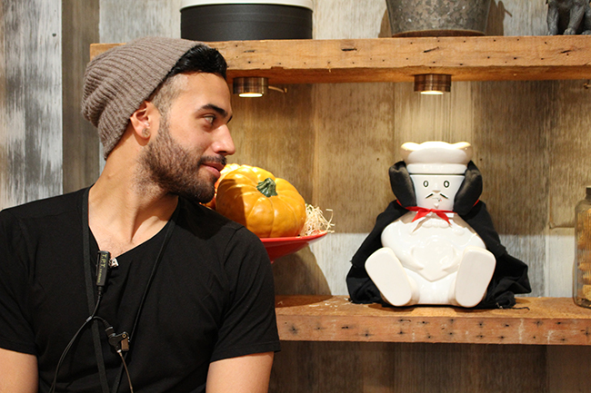
My favorite vampire.

halloween_baking_championship3.6pin it!

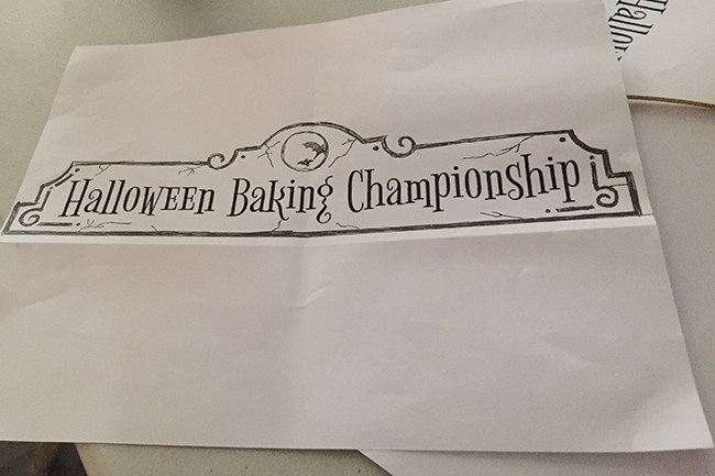
For the most part, I design and hand-draw the signage on all of our shows. I’ve gone back to using pen and paper when designing and I find that it’s so much more fun and freeing than designing everything on the computer.

halloween_baking_championship3.7pin it!

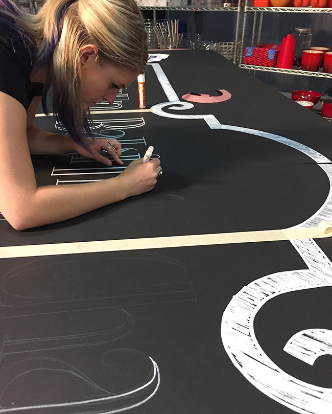
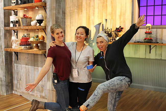
My awesome assistant Ryanne outlining letters in white paint pen.

halloween_baking_championship3pin it!

halloween_baking_championship4pin it!

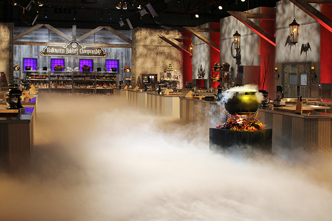
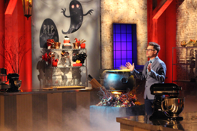
This “fire” is actually 3 light bulbs, and a mini fan blowing around small triangular pieces of white lining. TV magic!

halloween_baking_championship5.5pin it!

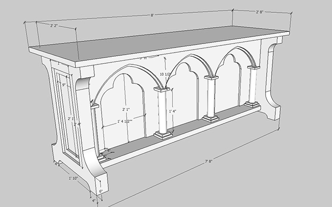
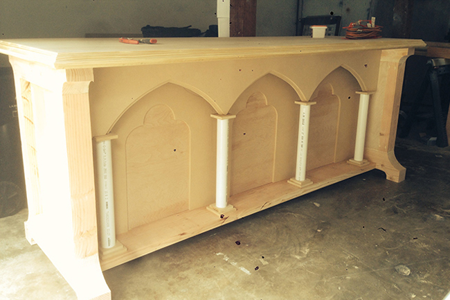
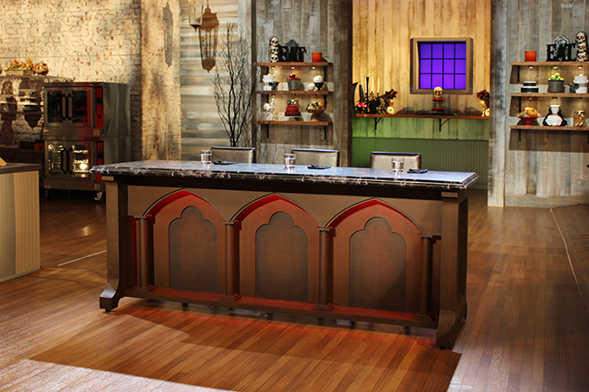
My carpenter Michael is basically like a human 3D printer. He can literally make anything. I drew this sketch of a gothic table, and 1 day later, he texts me this picture below. Like… no big deal… just banged out a custom judges desk in 8 hours. Ugh. Show off. ;)

halloween_baking_championship5pin it!

halloween_baking_championship6pin it!

halloween_baking_championship8.5pin it!

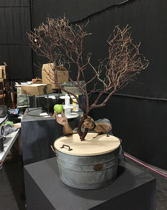
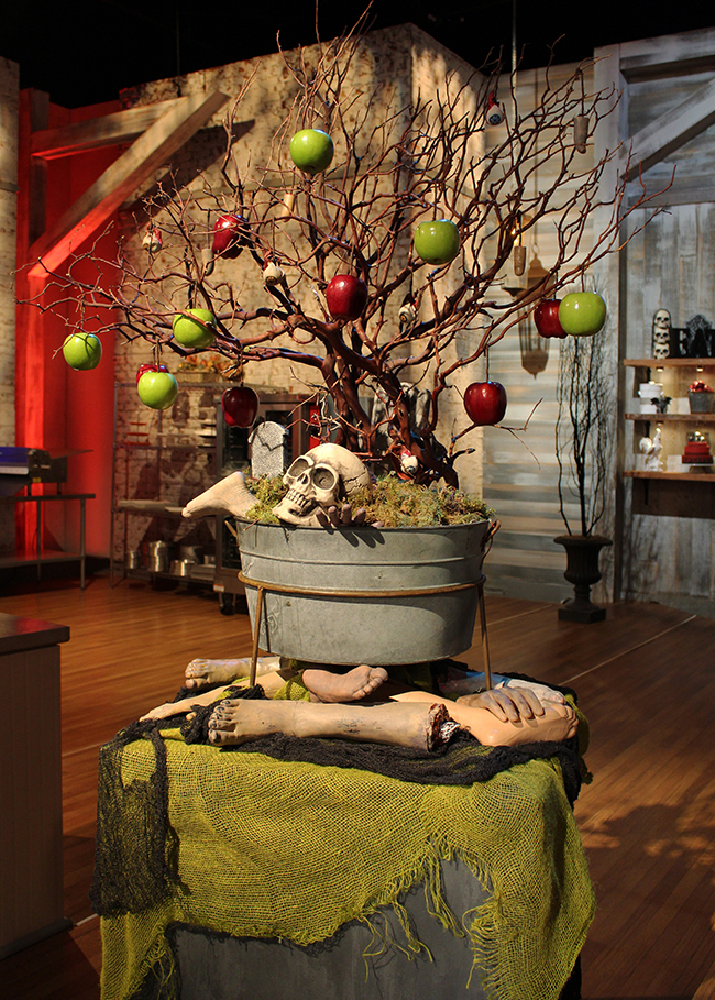
A big part of my job is figuring out how to visually convey ideas that the producers have for challenges. For this challenge, we needed a tree with 2 kinds of apples, the red ones would have secret ingredients written inside. The green ones would have creepy adjectives — and the bakers had to combine the two words and make something delicious and scary out of it. As you can see, not every display  is an instant success. It takes A LOT of collaborative brainstorming to get a galvanized bucket and a tree branch to a point where it’s TV ready.

halloween_baking_championship9pin it!

halloween_baking_championship8pin it!

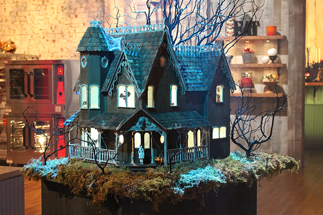
A dollhouse that we “hauntified.”

halloween_baking_championship10.5pin it!

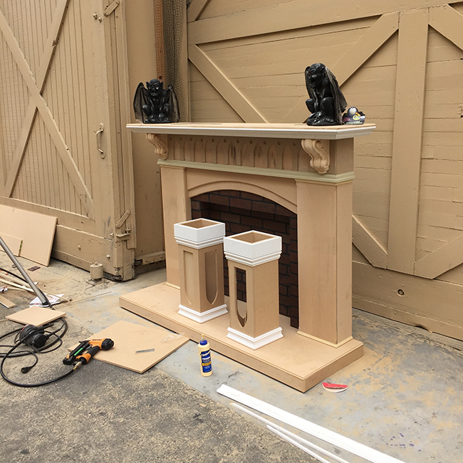
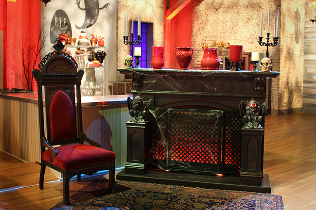
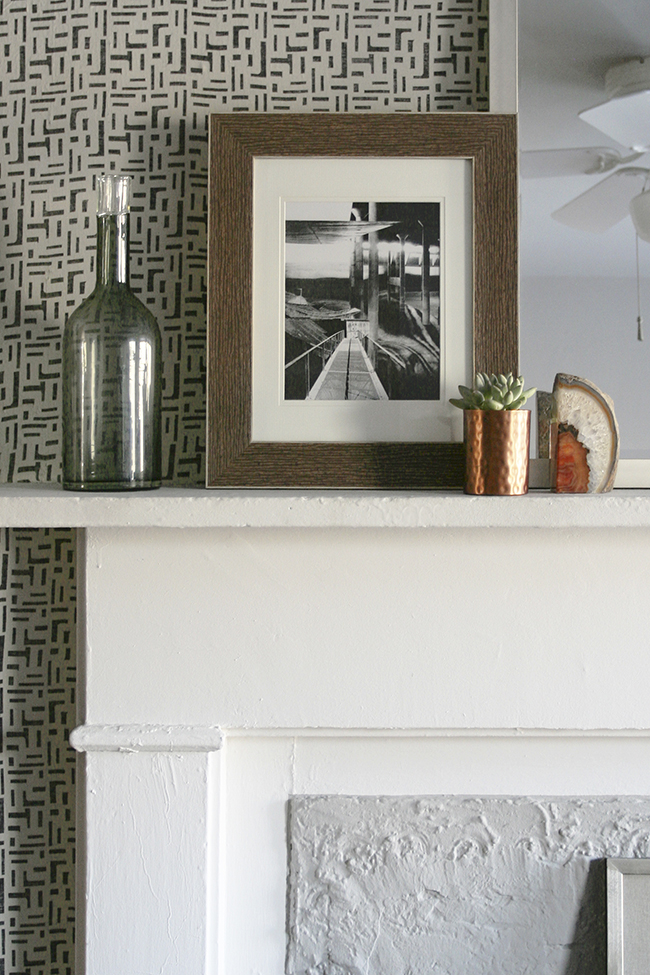
Again, Michael being crazy and amazing. I asked him to build a fireplace surround. Whatever he wanted…surprise me! And he took a pile of MDF and made it into this in a couple days.

halloween_baking_championship10pin it!

halloween_baking_championship11pin it!

That’s it for now, but the passing of Halloween means that everyone is going to be playing Christmas music by tomorrow. It also means that the Holiday Baking Championship is returning and my art department dressed the hell out of that set too, so come back soon for more pics!

Posted by Jen at 11:29 pm — 1 comment
Categories: ,
Sep 30

The California Cottage: Progress on the Kitchen.

In the 90s, most kitchens looked more or less the same — medium brown cabinets with brownish Formica or granite countertops. Sometime in the late 90s, the “great room” became a must-have for modern families and people were knocking down walls left and right to integrate kitchens with living space. The popularity of the great room lead to the rapid proliferation of the statement kitchen. Nowadays if you do any kind of kitchen image search, the variety of styles and materials that people are using in their kitchens is mind bogging and inspiring.

Kitchens are my favorite room in the house to design. I’ve always been obsessed with space planning and maximizing efficiency, so I was excited to overhaul the dumpy kitchen in my cottage. When most people think “cottage,” they imagine a space that is kind of rustic, warm, and maybe a little shabby-chic. As a design experiment, I veered away from a traditional cottage look and went for a more Scandinavian look, using really clean lines and stark color contrast.

04.2pin it!

I bookmarked a few images that tugged at my heart strings — all really bright and clean with a heavy dose of black and white. My kitchen is small and doesn’t get a ton of direct sunlight so the logical decision would have been to do white cabinets, but I had a hard time getting excited about an all white kitchen. I knew I was going to use Ikea cabinets and all of their white doors were either too plain, too traditional, or too glossy.  I hemmed and hawed about it for months and by the time I was finally ready to pull the trigger on cabinets, they came out with a new dark black-brown cabinet door called Tingsryd that has a subtle dark gray wood grain that ran horizontally. I was seduced by the idea of the high contrast, but I didn’t want to make the kitchen too heavy, so my solution was to do ONLY lower cabinets, concealing all of my food storage and appliances below the countertop.

01pin it!

This was my dumpy kitchen before. (It was a lot grosser in real life.) There was about 15 years worth of cooking grease and spider web build up. I planned on leaving the plumbing and gas lines in the same place.

02pin it!

03pin it!

One of my biggest issues with this space was the windows. It drove me nuts that they all had different mullions—4 paned, 6 paned, and 9 paned windows all along one wall! It took a bit of sleuthing, but I figured out that the 4 paned window originally belonged in the back of the cottage in the bedroom, the 6 paned window originally belonged in the dining room of the main house but was removed to accommodate a window a/c, and the 9 paned window was just some random one-off that didn’t match anything on my property.

04pin it!

I demolished the kitchen myself. Whoever installed the previous kitchen used about 1000 screws and nails to fasten the cabinets to each other and the walls. It was not an easy feat, but eventually I managed to rip all of the cabinets out. I threw away the weird triangular cabinets that fit in the angled part of the bay window. I kept the cabinets that were still in tact and moved them to my shed to use as storage.

06pin it!

I pulled out the window in the center because it drove me nuts that there were 3 asymmetrical windows. I planned on covering that gaping hole with drywall and wood siding on the outside. I also ran laminate flooring across the entire room before bringing in any kitchen components. 

07pin it!

My amazing friend Michael helped me install the kitchen. There were some complex/funky angles in this project and he made my narrow rectangular cabinet in to 90-degree trepezoid cabinets like the one you see on the left!

08pin it!

I splurged on quartz countertops. I’m a messy artist at heart, and I knew that I would need a relatively indestructible countertop to stand up to my abuse. You can’t really tell in this pic, but the quartz is warm white with tiny speckles in it. I love it.

09pin it!

I wanted SO badly to have a matching under cabinet fridge and freezer, but because of the space constraints, that just wasn’t possible. It doesn’t really bother me, though because both of these are concealed behind doors.

10pin it!

We installed a small sink, 24″ gas stove, and Michael framed out my window openings and made me new custom windows :).

12pin it!This is more or less what the kitchen looks like today. Ain’t it pretty? My pulls are black, so you can barely see them. I need to put a door over the microwave, but it’s a weird size, so it needs to be customized. Hopefully I’ll have time to do that soon. Now I’m trying to decide on a backsplash material. I love this tile that I saw at home depot because it looks A LOT like my floor. But is it too plain? I’m also auditioning other crazy patterns and materials. More on that in the next post!

Posted by Jen at 5:17 pm — 2 comments
Categories: , ,
Mar 23

The California Cottage: Invisible Work.

Hi guys. I’m alive. My dumpy cottage is looking pretty awesome (at least to me), but it probably looks so-so to everyone else because most people didn’t see how tragic it was before I started the renovations. (SO tragic, that my friend Sue insisted that I refer to it as a “shack” rather than a cottage.)

My roommates and I recently had some people over for a BBQ and a lot of folks asked me, “So what kind of renovations have you been doing?” My response: “I’ve basically been spackling for 12 hours/day for the last month.” NO JOKE.  Allow me to share some details shots of the the general crustiness and you’ll get the gist.

wtfpin it!

I can’t tell if the people who built/renovated this place cared a lot (by installing a cove ceiling, bay windows, etc), or just didn’t give a s**t (as illustrated by the images above). I knew what I was getting into when I bought the place, and I am comfortable with “extreme cosmetic repair,” so that’s what I’ve been doing for the last 2 months. It’s really not fun at all, but it’s satisfying enough that I’m willing to do it just to see it done.

I’ve been wanting to share some progress pictures, but the truth is… for a long time there wasn’t really much to see — just a bunch of bad iPhone pictures of dirt and spackle.  I’ve been doing a lot of what I call “invisible work” — meticulous, mundane, time consuming, not-exciting work that includes:

-demo and cleaning

-installing new drywall

-smoothing out lumpy walls and trim

-re-hanging doors and windows so they open out, rather than in,

-repairing busted windows

-spackling, patching, painting, and repeat, repeat, repeat until my arms fell off

At this point, the bedroom is 80% done, the living/dining is 65% done, and the bathroom is just terrible, so let’s not talk about it. Since the bedroom is looking the most presentable of all the rooms, I’ll start by showing you some pics of that first.

001pin it!

If you read my last blog post, you may remember this “before” photo.  The paneled wall on the right was kind of spongey and I couldn’t resist peeling back the layers to see what was back there.

002pin it!

003pin it!

Behind the wood paneling was… 50’s drywall? I’m not sure what they used to make walls out of, but this stuff was kind of soggy and crumbling too and covered in 2 layers of textured wallpaper, so I took a crowbar to it and found…

004pin it!

The original wood plank for the cottage! This is both the interior and exterior wall. Obviously, this had to stay, but there was definitely some termite damage, so after I demolished all of the old drywall, I rolled on 3 coats of this green foamy wood preservative that is supposed to inhibit termite damage and rot. It seemed to cover really well, but it smelled like death, so if you plan on using it indoors you definitely can’t live in a space and use this stuff at the same time.

006pin it!

After a few rounds of DIY termite damage control, I hung brand new drywall. Basically all the walls around the perimeter of the cottage had to be re-done, but the interior walls (bathroom/wall separating the bedroom and cottage) were fine and just needed some patching.  Oh! I also built a new door frame for my bathroom door. That’s the fun stuff that I actually enjoy doing.

007pin it!

Now that everything is primed, it looks and feels so CLEAN. The new walls basically took 45 years off this place. Oh, and I painted my ceiling pink! WHO AM I?! Don’t worry, I’m wallpapering this room, so don’t judge my poorly cut paint lines.

Annnd… that’s all I have for you for this side of the room. It hasn’t really evolved much since. In fact, I took the door off for repair and painting, so in a way, this corner is looking even worse than it does in this pic. MOVING ON!

01pin it!

This is the other side of the room. Whoever installed the bay window stopped short of completion and it just sat there looking sort of sad for decades. At some point someone used this nook as a closet, which is creative, but… NO. This little corner needed A LOT of love.

03pin it!

First, I took off the drywall to see what was underneath. The bay was encased in plywood that was relatively flush and in okay condition, so I slathered joint compound on it, sanded, slathered, sanded, then built a little window sill.

05pin it!

The bay window had a soggy ceiling that had some small holes and cracks.  I briefly contemplated just patching over it, but then curiosity got the best of me and I decided to smash my hammer through it just for kicks and before you know it, I had to rip the whole thing out and re-drywall that too. More spackle, more sanding, more paint. OH THE JOYS.

07pin it!

This is the bay, nearly ready for paint. I sanded down the blue because it was lumpy and the blue paint had poor adhesion to the layer of paint beneath it. I added baseboard, ripped 1000 staples out of the windows, and patched those too.

08pin it!

BUT LOOK! As you can imagine when I FINALLY got to prime this wall, I nearly jumped for joy.

09pin it!

And then, friends, this is why I do what I do. By the time the patching and painting was done, I was feeling zen and decided I could handle installing floors myself. I took my time with it and made sure to be super precise with my cuts, and it was actually not a terrible project to take on by myself. I bought the flooring from Best Laminate after auditioning literally 25 different shades of white/gray and I am LOVING the color. This is exactly what I wanted. Something a little rustic, but also a little modern and Scandinavian.

10pin it!

I moved my bed in, and though it still needs furniture, curtains, and wallpaper, it’s totally cozy and livable. I don’t want this post to get ridiculously long, so I’m going to stop there and post updates on the living/dining area next time.

Posted by Jen at 8:49 pm — 3 comments
Categories: , ,
Feb 24

A Fabric Wall in my Bedroom.

IMG_2830pin it!

As most of you know, I lived in a teeny tiny bedroom for 6 years. My apartment has one big room and one small room and I decided early on that it made sense for me to take the small room because I travel a lot for work. It turned out to be one of the best decisions I’ve ever made—my fancy tiny bedroom received quite a bit of press, I saved money, and I met wonderful roommates along the way.

When my beau moved in with me, we decided to migrate over the big room and use the small room as a home office/guest room. As much as I loved my last roommate, Katie’s room, (which Andrea and I made over years ago), I was excited to decorate and experiment with some new styles and techniques.

curtain0pin it!

Goodbye triangles! (I still love them, but it’s time for a new look.) First things first, I painted the room a light warm grey called Collingwood by Benjamin Moore. This is one of my all time favorite neutral colors. I used it years ago in my client, Sarah’s house, and I mentally bookmarked it as  color I’d like to use in my own room some day. You can’t really tell in these pictures, but the ceiling is kind of lumpy from being patched so many times, so the line between the wall and the ceiling is not straight. It was driving me nuts, so I painted the ceiling Collingwood as well. This made a HUGE difference! It really de-emphasized the imperfect ceiling.

curtain2pin it!

After painting the entire room, the dark grey fireplace mantle felt too heavy. Something about the IKEA shelf on the left and the black dresser on the right just wasn’t sitting right with me. The room felt off balance because there was very little furniture on the other side to balance out the 3 dark pieces. If the mantle wasn’t going to be grey, the next logical option was white. That didn’t feel right either because white mantles are pretty, but a little too preppy for the look I was trying to achieve. I wasn’t sure if black-white-black would look too contrasty. After hemming and hawing for hours and auditioning every paint color that I had in my utility closet, I finally decided to custom mix a color.

curtain3pin it!

I mixed 2 parts Collingwood with 1 part white, and created this really nice light grey. I’m really happy with the way it turned out—the fireplace stands out from the wall, but it’s not a focal point that is screaming for attention. After the fireplace was painted light grey, the square in the middle (that was sealed up and smeared with concrete at some point) started to look naked, so I used the same technique—mixing Collingwood with a squirt of black— to make another custom color just for the center. Overall this wall was looking pretty swell, and any normal person would have just slapped a mirror on there and called it a day. But NOOO…I just HAD to do something zany to the wall. I guess I was used to seeing the triangles there, and without them, it looked a little lackluster. I love high impact wall treatments, like this one and I sometimes get the itch to try out new techniques, just so I can say that I did, so I started looking for a pattern that would go with the “Nate Berkus on a budget” look that I was going for. This involved another afternoon of hemming and hawing. My internal dialogue went something like this: Should I paint something? Should I use fabric? Should I used mud cloth? Is that too ethnic? Are triangles too trendy? Is this pattern going to take 90 hours to paint? Ugh. Sometimes I annoy myself. You know what also annoys me? My bad iphone photos of this project.

curtain4pin it!

I found this curtain panel on Crate and Barrel’s website, and it seemed to fit the bill: not colorful, not too girly, interesting but not indicative of any particular style or period. I went to scope it out at their uptown location and decided that for $44 it was worth a shot.

curtain5pin it!

I heard somewhere that you can use liquid starch to adhere fabric to walls. Some people use this as a substitute for wallpaper because starched fabric is completely removable. I’d been dying to try this for years, so as soon as I got the fabric, I was really excited to start, and never thought in a million years that it would be nearly impossible to find liquid starch in this city! I went to the drug store, the grocery store, Target, and 3 bodegas and had no luck. I finally just picked up 2 cans of spray starch and figured if I saturated the fabric, it would be just fine. I was wrong. My first pass at this project SUCKED. No matter how much spray starch I used, the fabric wouldn’t stick, so there were spots that were bubbling or wrinkling. My boyfriend came home in the middle of my project and had to console me because I was pouting about my botched mission. I decided to leave it up and sleep on it, hoping that it would miraculously look perfect in the morning.

It didn’t. It still looked crappy. The next day, I ventured out and searched 5 more bodegas and FINALLY found a bottle of liquid starch. I scampered home, ripped the wrinkly fabric off the wall (it came off clean!) and dunked the whole thing in a bucket of liquid starch. Let me tell ya, that made all the difference. The rest of the project went relatively smoothly.

curtain6pin it!

Guys, I got SO lucky with this curtain panel. I literally had 2 centimeters left when I was done. The panel was 4′ wide and my wall was 4′ tall. I actually had to take out the hem on the edge so there wouldn’t be a bulky bump and so I’d have just a bit more leeway with the positioning. After I smoothed the fabric onto the upper part, I cut the scrap in half and put one on each side of the fireplace, which made it look a lot more balanced.

curtain7pin it!

Oh, I also spray painted the ceiling fan. It was REALLY ugly, but it does provide a nice breeze in the summer. One thing that sucks about living in a city that has “real winter,” is that you can’t do projects outside. Spray painting indoors is basically the worst idea ever, but I’m impatient and didn’t want to wait till summer so I just did it in the room. I know, I know…loss of brain cells. I should know better . I took this opportunity to try out a new product: Killz odorless primer.   While it is far from “odorless,” it is substantially less horrible smelling than regular spray primer. It goes on super smooth and opaque and the smell dissipates faster than with most sprays, so I’m going to give it my stamp of approval.

curtain8pin it!

I was stoked to discover that the backs of the blades were plain, so I took the hardware off each one and flipped the blade over and sprayed the back side. The picture above left is after just one coat of paint. Pretty impressive, Kilz! I taped around the ceiling mounted portion and sprayed it while standing on a chair. My handy bf helped me re-assemble it.

IMG_2812pin it!

IMG_2786pin it!

Well there she is! You can really see how wavy the ceiling line is and how lumpy the fireplace is, but it honestly doesn’t really bother me that much. I’ve never lived in a room this big and nice, so I’m happy to embrace this 115 year old building, lumps and all!

Posted by Jen at 8:00 pm — 5 comments
Categories: , ,
Feb 8

Design on a Dime: Frameless Framed Art.

blog1pin it!

As a set designer and general interior design junkie, I spend a good chunk of my life thinking of ways to fill up wall space with thoughtfully curated stuff that’s nice to look at. I love a good gallery wall as much as the next civilian but everyone knows that obtaining the art itself is only half the battle (and half the expense). Then you have to deal with frames which is a pain in the a** and often very expensive. Fortunately the Swedes blessed us with IKEA, where you can get decent medium sized frame for $20, but for once in my life, I said to myself “Jen. STEP AWAY FROM THE IKEA.”

I’m in the process of gathering furniture and decor for Natasha’s apartment makeover. Our Society 6 prints showed up in the mail a few days ago, and I’m really happy with them! They’re printed on really good paper, so the colors are extra vibrant. I needed to frame them somehow, but for some reason, I wasn’t in the mood to buy boring store-bought frames (most of the pieces were non-standard sizes, so it would have been a headache to find the right frames anyway), and custom frames were out of the budget. Natasha has a Banksy print on canvas that’s hanging on the brick wall behind her sofa, and I like the simplicity of it. No frame, no fuss. Just a rectangle floating on a brick backdrop. That inspired me to treat these prints more canvases by making wood panels for each of them.

7 simple steps to making wood panels:

process1pin it!

1) I Bought 1×2 clear pine and cut each piece to size using a miter saw. I made sure my outside measurements were 1/4″ smaller than the actual print so when I mounted them, I would have some wiggle room. I used a little glue and a nail gun to secure them together. This was the first time I used frame clamps and they were awesome!

2) Just for a little variation, I made 2 of the frames deeper (with the 1×2 wood on it’s side) and 2 of the frames more shallow (with the 1×2 wood laying flat). Then Aaron cut 1/8″ masonaite boards to size and I fastened those with a little glue and nails as well (not pictured, sorry!)

process2pin it!

3) I carefully painted the frames, but chose not to paint the edges of the masonite. I kind of liked the brown edge of the board. Each frame was painted with 2 coats.

4) I trimmed some of the excess paper off of the prints, only leaving about 1/8″ white border so I would have something to grab onto while I was gluing them down.

process3pin it!

5) I took the prints into the hall, put them on a clean surface, and gave them a good even coat of Super 77 spray adhesive. If you try this, make sure you use a new clean surface every time.

6) I carefully placed the print on the board and smoothed it out. It was pretty easy because the paper was thick, but if you’re doing this with a thin paper, it’s probably better to have a friend help you by holding up one side while you place the other.

process4pin it!

7) Lastly, I just flipped the whole thing over and trimmed the excess paper.

blog2pin it!

And that’s it! It only cost me $20 for the lumber. Everything else I had lying around the house. The prints were about $150 total, which ain’t bad. I think they’ll add a lot to the space. Here are the prints that I chose for Natasha:

Pinky Promise by Emily Rickard

Chevron Flora II by Bianca Green

MEOW by Wesley Bird

Lions and Bears Party by Jenny Liz Rome

For this grouping, I did a mockup of the prints in photoshop and ordered them after I was sure I’d like the way they looked together. After I received them, I realized that there are definitely reoccurring motifs. 2 of the prints are black and white. Two contain pink. Two contain cats. Two contain triangular points.

I love that Society 6 has a ridiculously huge selection so if you want to do a grouping of camels or sunsets or botanicals or whatever, you have a ton of options to choose from.  A lot of people ask me for my opinion on whether or not art matches (either their decor or other art in the room). There are a few schools of thought here. The first is: choose whatever you like. If it doesn’t match, oh well. The second is: find colors, shapes, and subject matter that are similar. This is the method that I use. It sounds really simple, but it’s surprisingly difficult to strike that balance where your pieces coordinate but they’re not so similar that they clash…if that makes any sense. These days I’m trying to be a little more relaxed when I’m decorating and styling. I want to be a little more open to things that look weird together, but in a good way. Maybe next time I’ll do a post about stuff that looks good together but doesn’t match at all.

Anyway, frames are done. Dining chairs are in. Bar cart is being gold leafed this week. The rug was ordered but mistakenly shipped to Chicago (sigh, long story). More pictures and projects from Natasha’s makeover to come!

Posted by Jen at 7:47 pm — comment
Categories: ,