As a set designer and general interior design junkie, I spend a good chunk of my life thinking of ways to fill up wall space with thoughtfully curated stuff that’s nice to look at. I love a good gallery wall as much as the next civilian but everyone knows that obtaining the art itself is only half the battle (and half the expense). Then you have to deal with frames which is a pain in the a** and often very expensive. Fortunately the Swedes blessed us with IKEA, where you can get decent medium sized frame for $20, but for once in my life, I said to myself “Jen. STEP AWAY FROM THE IKEA.”
I’m in the process of gathering furniture and decor for Natasha’s apartment makeover. Our Society 6 prints showed up in the mail a few days ago, and I’m really happy with them! They’re printed on really good paper, so the colors are extra vibrant. I needed to frame them somehow, but for some reason, I wasn’t in the mood to buy boring store-bought frames (most of the pieces were non-standard sizes, so it would have been a headache to find the right frames anyway), and custom frames were out of the budget. Natasha has a Banksy print on canvas that’s hanging on the brick wall behind her sofa, and I like the simplicity of it. No frame, no fuss. Just a rectangle floating on a brick backdrop. That inspired me to treat these prints more canvases by making wood panels for each of them.
7 simple steps to making wood panels:
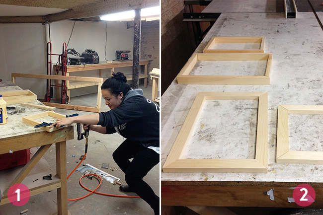
1) I Bought 1×2 clear pine and cut each piece to size using a miter saw. I made sure my outside measurements were 1/4″ smaller than the actual print so when I mounted them, I would have some wiggle room. I used a little glue and a nail gun to secure them together. This was the first time I used frame clamps and they were awesome!
2) Just for a little variation, I made 2 of the frames deeper (with the 1×2 wood on it’s side) and 2 of the frames more shallow (with the 1×2 wood laying flat). Then Aaron cut 1/8″ masonaite boards to size and I fastened those with a little glue and nails as well (not pictured, sorry!)
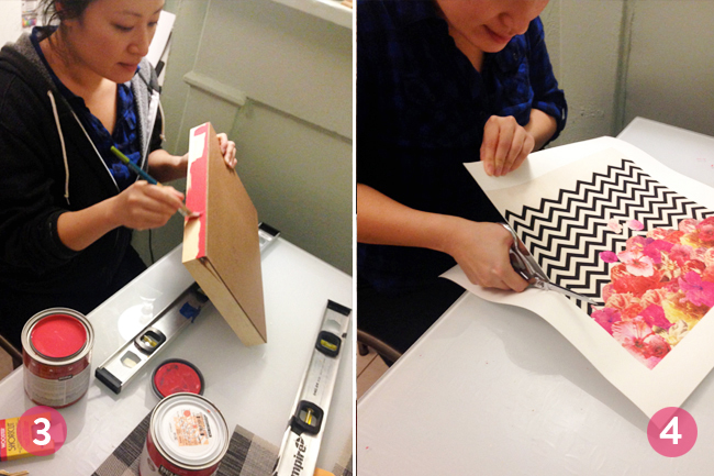
3) I carefully painted the frames, but chose not to paint the edges of the masonite. I kind of liked the brown edge of the board. Each frame was painted with 2 coats.
4) I trimmed some of the excess paper off of the prints, only leaving about 1/8″ white border so I would have something to grab onto while I was gluing them down.
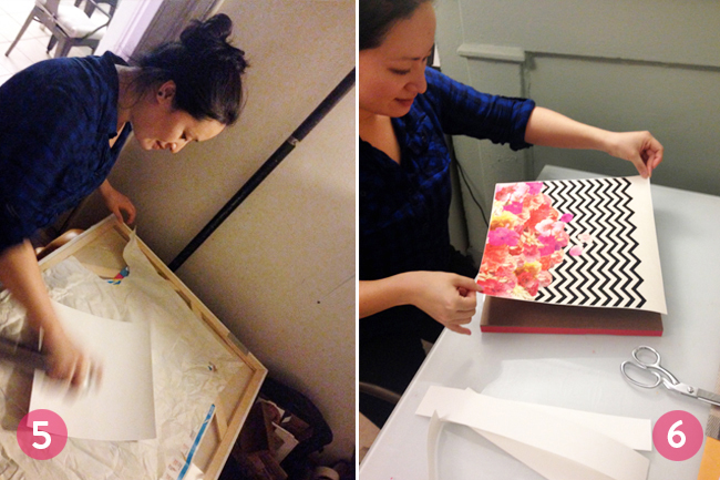
5) I took the prints into the hall, put them on a clean surface, and gave them a good even coat of Super 77 spray adhesive. If you try this, make sure you use a new clean surface every time.
6) I carefully placed the print on the board and smoothed it out. It was pretty easy because the paper was thick, but if you’re doing this with a thin paper, it’s probably better to have a friend help you by holding up one side while you place the other.
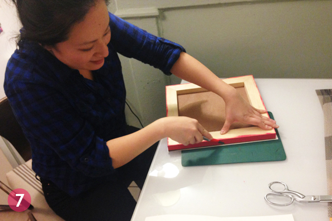
7) Lastly, I just flipped the whole thing over and trimmed the excess paper.
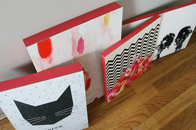
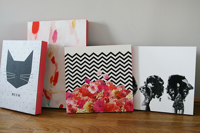
And that’s it! It only cost me $20 for the lumber. Everything else I had lying around the house. The prints were about $150 total, which ain’t bad. I think they’ll add a lot to the space. Here are the prints that I chose for Natasha:
Pinky Promise by Emily Rickard
Chevron Flora II by Bianca Green
MEOW by Wesley Bird
Lions and Bears Party by Jenny Liz Rome
For this grouping, I did a mockup of the prints in photoshop and ordered them after I was sure I’d like the way they looked together. After I received them, I realized that there are definitely reoccurring motifs. 2 of the prints are black and white. Two contain pink. Two contain cats. Two contain triangular points.
I love that Society 6 has a ridiculously huge selection so if you want to do a grouping of camels or sunsets or botanicals or whatever, you have a ton of options to choose from. A lot of people ask me for my opinion on whether or not art matches (either their decor or other art in the room). There are a few schools of thought here. The first is: choose whatever you like. If it doesn’t match, oh well. The second is: find colors, shapes, and subject matter that are similar. This is the method that I use. It sounds really simple, but it’s surprisingly difficult to strike that balance where your pieces coordinate but they’re not so similar that they clash…if that makes any sense. These days I’m trying to be a little more relaxed when I’m decorating and styling. I want to be a little more open to things that look weird together, but in a good way. Maybe next time I’ll do a post about stuff that looks good together but doesn’t match at all.
Anyway, frames are done. Dining chairs are in. Bar cart is being gold leafed this week. The rug was ordered but mistakenly shipped to Chicago (sigh, long story). More pictures and projects from Natasha’s makeover to come!


